The UNIVERSEity
New starters at a university are handed an org chart as a PDF. Nine divisions, a couple of hundred teams, everything the same size and the same colour. Then we're surprised when six months later they still don't know who to call.
The other version of the org chart
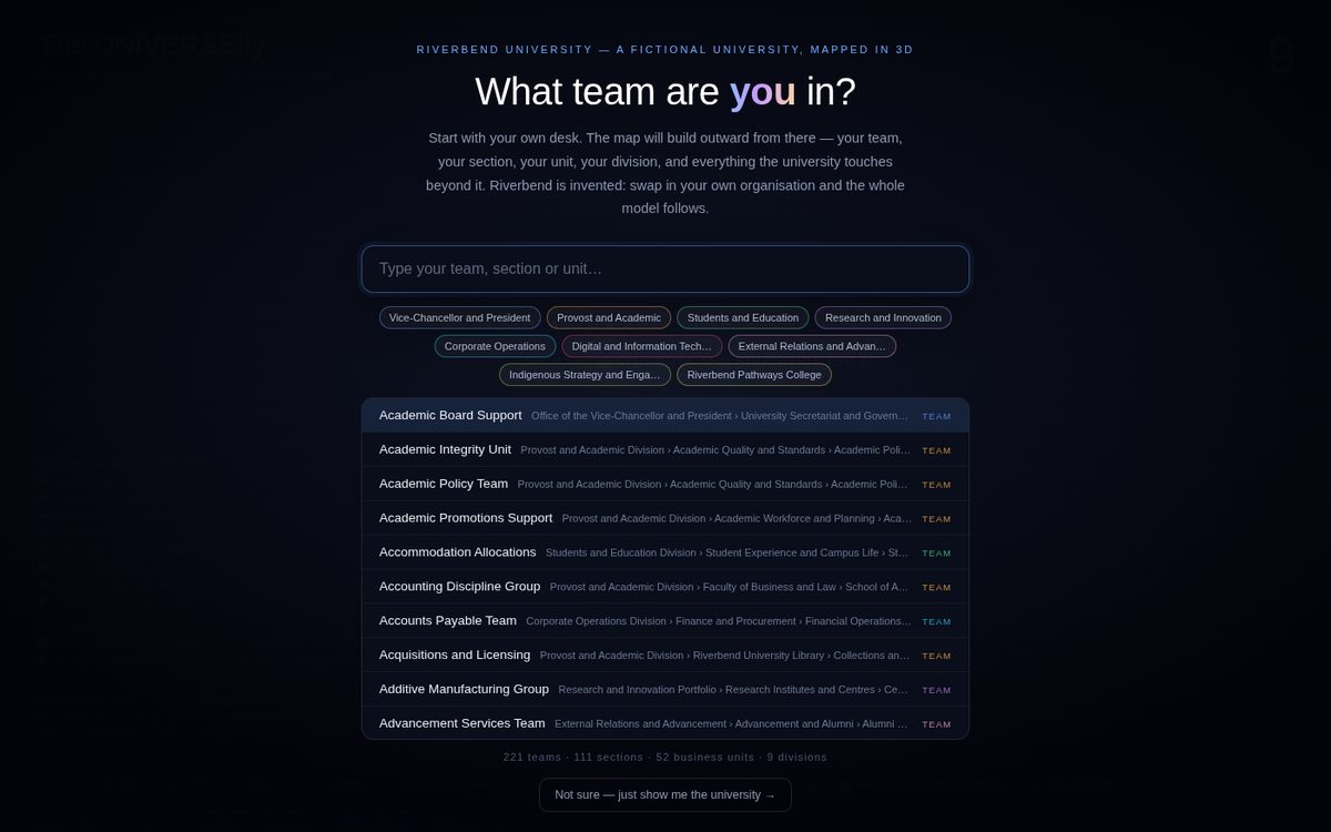
Type in where you work and it flies you to your own team, then lights up everyone you actually deal with. Press a key and it traces a real process (a complaint, an enrolment, a course approval) hop by hop across the organisation, so you can watch the handoffs that normally live in a procedure document nobody reads.
Around the outside sit the bodies the institution answers to: regulators, unions, councils, partners. Those relationships are usually the hardest thing to explain to someone in their first month, and they're the first thing this makes visible.
A template, not a one-off
The org chart, the external bodies, the standing relationships and the traced processes are one editable data block at the top of the file. Point it at a different institution and everything regenerates from that block: the geometry, the labels, the search index, the camera paths.
The version above runs on a fictional institution, Riverbend University, so nothing here belongs to a real client. The structure is the shape a real university tends to have, which is what makes it recognisable while belonging to nobody.
Induction
Give a new starter their own position in the organisation on day one, rather than in month six.
Process literacy
Show a policy or complaint pathway as movement between real teams, instead of as a swimlane diagram.
Restructure comms
Explain what a change actually does to reporting lines, in a way people can see rather than parse.
Want this pointed at your institution?
The template takes your structure. The build takes a conversation.
Get in touch